| Learn about the executive MBA program. |
Monday, January 19, 2009
Wednesday, January 14, 2009
Welcome the the 2008-2009 NBA Uniform Rankings.
Each jersey is critiqued in three categories...Appeal, Colors and Style.
Appeal: The over all look of the jersey and how it looks as a whole.
Colors: How the teams colors are used in the uniform.
Style: The individual components (lettering, logo, etc) and how it flows.
Each Category is worth 100 points and totaled up to create the Jerseys Rank.
(Please send me your own rankings. And I will keep track of those as well if one Jersey seems to be high on your lists I will move it up, but lets settle this once and for all.)
Here they are...Enjoy.
#30. San Antonio Spurs

Appeal(1oo): 1
Color(100): -10
Style(100): 10
Total: 1
This is the most pathetic jersey in the NBA. Colors are Black and white? Absolutely nothing original and appealing about this. This brings nothing to the table. Boring jersey from the most boring team to watch in the entire NBA, why am I not surprised. Oh San Antonio you have no idea how much everyone hates you. This jersey doesn't help your cause.
#29. Washington Wizards

Appeal(1oo): 0
Color(100): 0
Style(100): 38
Total: 38
What the hell where they thinking? Gold and black? The design is not so bad but the colors just kill it. Although it does have the most potential. Why not try the other blue jerseys with this scheme? I think that would look amazing. This jersey is the second most shiniest below denver, also why I can put it any higher.
#28. Detroit Pistons

Appeal(1oo): 25
Color(100): 22
Style(100): 19
Total: 66
I like the blue on front and red on the back. And yes the colors are nice but I'm sorry its been done before. I would like to see some kind of style in it other than what it has which is none. Its when no flavor has been put into the jersey that really makes me mad.
#27. Milwaukee Bucks

Appeal(1oo): 23
Color(100): 10
Style(100): 27
Total: 70
Christmas Day Jerseys? So maybe where them on Christmas, and put them in a box until next year. Slightly
3D logo? Good try on trying to work with odd colors. Maybe change those first and give me a call, if someone gave this to me id put it in the trash. Just hard to be taken seriously with a mascot that is a deer...
#26. Charlotte Bobcats

Appeal(1oo): 31
Color(100): 40
Style(100): 10
Total: 81
Italic logo and numbers? Okay? Was this jersey made on Microsoft Word? This is all it takes to make a NBA worthy jersey? This is the worst logo I have seen in my whole life. And Bobcats? Congratulations you have now joined the other 10,000 high schools with the same mascot.
#25. Los Angeles Clippers

Appeal(1oo): 24
Color(100): 25
Style(100): 33
Total: 82
Again with the Red, White and Blue. And why is there a blue background on the "C". On first glance it looks like Olippers. Although I am a fan of the smaller numbers off centered. Does anyone even like the Clippers anymore? They are like the B team to the Lakers.
#24. Philadelphia 76ers

Appeal(1oo): 39
Color(100): 33
Style(100): 28
Total: 100
Okay alot of problems with this one. Logo designed by a 8th grader? What is up with the numbers, non-full blocked numbers. Ambitious but still failed miserably. And what's with the alts that say "Phila" on them? Only Phoenix can abbreviate (PHX) and look good.
#23. Sacramento Kings

Appeal(1oo): 18
Color(100): 74
Style(100): 21
Total: 113
Great royal colors. Although not much else great about it. The "i" in kings has a crown but can only be seen if you have floor seats. No design on the sides kills it. But who would buy season tickets to go see... whoever is still on the kings.
#22. Utah Jazz

Appeal(1oo): 31
Color(100): 56
Style(100): 33
Total: 120
What happened to the old Jazz with the peaks jerseys? Trade them in and kill an amazing color scheme that what happened. Went from interesting to dull. The old ones would have been a serious contender for top 5.
But this is boring. And we all know it.
#21. Atlanta Hawks

Appeal(1oo): 47
Color(100): 55
Style(100): 33
Total: 135
Ah yes the shadow letters work well. And the black brings out the sides. Too bad compared to all the past uniforms this one is garbage. And there alt. jersey is just team switching there colors to Red,White and Blue isnt that the same as..., Cleveland, Pistons, Clippers and New Jersey... I just dont get it.
#20. Denver Nuggets Detroit

Appeal(1oo): 47
Color(100): 55
Style(100): 36
Total: 138
Well its hard to know something that does nothing wrong nor nothing right. Where are the old school jerseys with the rainbow skyline from the 80s? Amazing, and these...meh. All they managed to win is the contest for having the shiniest uniforms in the NBA. Well done Denver.
#19. Indiana Pacers

Appeal(1oo): 43
Color(100): 56
Style(100): 51
Total: 150
One of the coolest sides. Simple but it works. Although not much else. Centered curved name works well and decent colors. I guess how do yo incorporate a pacer when know one ever knows what a "pacer" is. So they are doomed to have mediocre uniforms forever.
#18. New York Knicks

Appeal(1oo): 54
Color(100): 62
Style(100): 39
Total: 155
Again I think the curved city name works well in this case. But where is the originality? I think its a better version of the colors used by Charlotte. Cant knock it because its not bad but no where near its potential with the biggest market. Blocked numbers work good but with all the art/monuments/uniqueness of NYC this uniform ranks pretty dull.
#17. Chicago Bulls

Appeal(1oo): 56
Color(100): 88
Style(100): 31
Total: 175
Classic...I get it. But could be legendary. I think the striped sides work the best on here as with Boston. Just slightly below mediocre and thats why its #17. Great colors, love em. Best team in all sports that pull of red uniforms so well. Chicago is amazing id rather see the sity name on here than the word Bulls.
#16. New Jersey Nets

Appeal(1oo): 67
Color(100): 58
Style(100): 51
Total: 176
Great concept for putting the "nets" on the side. But still extremely conservative. And here we go again with Red and Blue colors. At least its a Navy Blue. This uniform is not bad and id like to the the font just slightly more bold. Like your proud of your city.
#15. Miami Heat

Appeal(1oo): 51
Color(100): 72
Style(100): 56
Total: 179
I still miss the old Pink, Orange and Black. But im coming around to the new ones. Number possibly a little to small but great colors. Cmon Miami get crazy with your uniforms. Lets see you turn up the "heat" on these things.
#15. Toronto Raptors

Appeal(1oo): 50
Color(100): 75
Style(100): 56
Total: 181
Simple but effective sides. And i really like the black Adidas choice when a white was probably pushed for. Not usually a fan of the slim font and numbers but I think it works here. Just wish the actual Raptors part was incorporated. And bring back the purple from the old uniforms.
#13. Golden State Warriors

Appeal(1oo): 33
Color(100): 74
Style(100): 79
Total: 189
Great colors. Solid neck. So much you could do with a name like the warriors and yet they blew it. But interesting color choice i think the used them quite well.
Well done golden state best combo of using all three colors strongly.
#12. Oklahoma City Thunder

Appeal(1oo): 56
Color(100): 90
Style(100): 44
Total: 190
New team new start. Great colors. Great font. Good multi color stripe on the sides. And yet a team named the Thunder there is not a single element to let you know that in any way. What a shame.
#11. Los Angeles Lakers

Appeal(1oo): 60
Color(100): 92
Style(100): 61
Total: 212
Classic if it were a little more exciting i would seriously put it near the top. Not a far of the white number, would prefer them purple. Logo is simple but extremely effective. I would say the best flowing logo in the whole league some times the simple ones work.
#10. Memphis Grizzlies
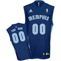
Appeal(1oo): 62
Color(100): 78
Style(100): 73
Total: 213
Innovative number colors and design. As well as the name. But I loved the Teal when they were in Vancouver. Its too bad that they pretty much just stole the colors from the new Utah. But potential is high.
#9. Houston Rockets

Appeal(1oo): 87
Color(100): 84
Style(100): 59
Total: 230
Improvement from the old Blue and Reds. Great tittle- straight forward perfect numbers. And I think the sides work great. For Houston this perfect. Logo is great. White simple with the red lines shooting down the sides. There is a great flow to this whole uniform.
#8. Phoenix Suns

Appeal(1oo): 43
Color(100): 100
Style(100): 88
Total: 231
Ah the Suns. We all miss the flaming basketball uniforms of the 90's maybe the Heat could steal it. Corky colors but some how it works. Love the abbreviation of Phoenix. And the circle around the front numbers. Solid jersey. Suns keep it simple but if you look more deeply you see the genius and flow of the uniform. City abbreviations is the futures.
#7. Minnesota Timberwolves

Appeal(1oo): 63
Color(100): 86
Style(100): 91
Total: 243
Many people put this as #1. I agree its great but not the best. Perfect colors on the side with the green at the bottom. And the logo is simple. Im still waiting till the make green the primary color as a jersey and ill it will sky rocket. Many people fail to see how rich and bright the green really it is the perfect shade.
#6. Boston Celtics

Appeal(1oo): 92
Color(100): 89
Style(100): 64
Total: 245
The simple change to the black outline from the white makes a huge difference. This jersey has stood the test of time, and I highly doubt it will ever change. And the white clover on the back seals the deal. Celtic pride. The history behind this classic uniform makes me believe that it cant ever be better.
#5. Orlando Magic

Appeal(1oo): 84
Color(100): 82
Style(100): 87
Total: 253
Wow what a great shade of Blue. And the white lines that spread towards the top give it good depth. Would love some kind of incorporation of the old magic logo with the star ( that Phili stole). Without that I cant put it higher than five. But i do believe this team will surprise many people this year.
#4. Dallas Mavericks

Appeal(1oo): 95
Color(100): 73
Style(100): 90
Total: 258
The green alt is great. Ive noticed they have have used it alot more. And I would too with 17 of the 30 teams having some form of blue in there jerseys. Great sides. Only one with four noticeable colors. And great logo looks retro and modern at the same time.
#3. Cleveland Cavilers

Appeal(1oo): 89
Color(100): 83
Style(100): 91
Total: 263
Colors good. Check. Good sides. Check. Logo good. Check. The little "c" on the neck. Great. Well done Cleveland. And I with they would make the new yellow ones the keepers they are amazing. Great jerseys for a team that will surprise everyone in the playoffs. The yellow uniforms would be number one if i see that they keep them longer.
#2. New Orleans Hornets

Appeal(1oo): 99
Color(100): 96
Style(100): 100
Total: 293
When I saw these for the first time. I almost dished out to get a CP3 one. My favorite colors. Works perfect. The only think holding it back are the sides. I would love to the the purple there thinly. Great Font. Simply a sight to behold.
#1. Portland Trailblazers

Appeal(1oo): 100
Color(100): 98
Style(100): 99
Total: 297
And finally. The composition is perfect and for that reason its the best. Love the colors and the off centered front numbers. The front numbers are different from the "Portland" font. And that makes it stand out so much more. Simple and effective. This is why Portland has the best jerseys in the NBA.
This website is obviously in no way affiliated with the NBA. All logos/uniforms belong to them and they have all rights reserved. This blog was made to make a point that the NBA needs to put some flavor into there league.
PLEASE
1. LEAVE ME A COMMENT
2. TAKE THE POLL OF YOUR FAV. UNIFORMS
3. SEND ME YOUR LIST OF THE BEST JERSEYS
4. SUPPORT THE NBA
Subscribe to:
Comments (Atom)

